Yelp Business Owner Application Design Sprint
I led a design sprint to revamp the BOA (business owner application) dashboard, collaborating with key stakeholders while also providing support to other designers to come up with innovative solutions. The sprint spanned three days, during which we reviewed user research and metrics, conducted a competitive analysis, organized an affinity mapping exercise to identify main focal points, and oversaw eight rounds of wireframing. The team then devoted additional effort to create high-fidelity wireframes based on the presented concepts.
Winter 2018
In Collaboration with Product Designers,
Product Design Manager, Product Managers,
Product Marketing Director, & other stakeholders
Product Design, User Research
Time: 1 Week
We organized a design sprint for the BOA (business owner application) dashboard redesign, inviting stakeholders to participate and provide their valuable insights and perspectives. Our goal was to collaboratively define the initial solutions and educate stakeholders on the design process from research to ideation phase.
Our target audience includes a wide range of small business owners, such as restaurant owners, service providers (e.g. salons, plumbers), and experienced advertisers, each with unique needs and preferences for using the business dashboard. Therefore, it was crucial to develop a versatile design that caters to multiple verticals instead of a one-size-fits-all approach.
Overview

Research
Affinity Mapping
In order to gather insights on user needs, feedback, and potential product improvements, I presented research findings from our UXR and data teams and then conducted an exercise with the participants. Each person wrote down their ideas on post-it notes, which we then sorted onto a chart organized by user verticals. This allowed us to identify which features and user stories made the most sense for each type of user.
For example, we found that a calendar/task management scheduler would be more relevant for a service provider (PLAH) than a restaurant owner (RFN). From there, we grouped similar post-it notes into themes to identify ways we could improve the platform.

Card sorting & Affinity Mapping — 8x8 wire-framing & voting

A clearer map of our high-level themes that came out of the affinity mapping session
Initial solutions
Each designer took a “high-level” problem category and created 8x8 wireframes. We presented it to each other and voted which ones we thought worked best. We moved forward with the high fidelity wireframes.
Ideations


*The wireframes & designs above are not mine — they are example iterations from the design sprint.
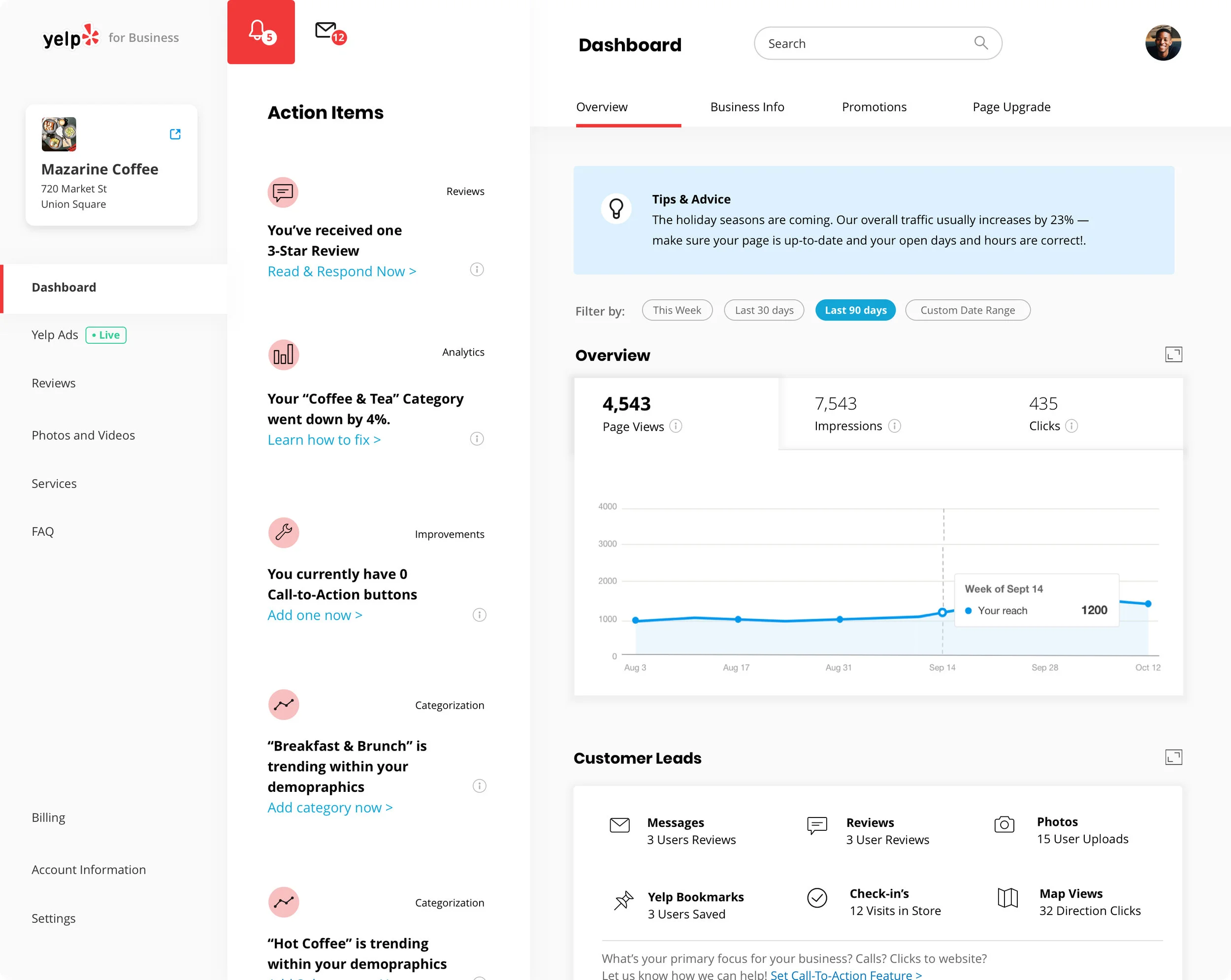
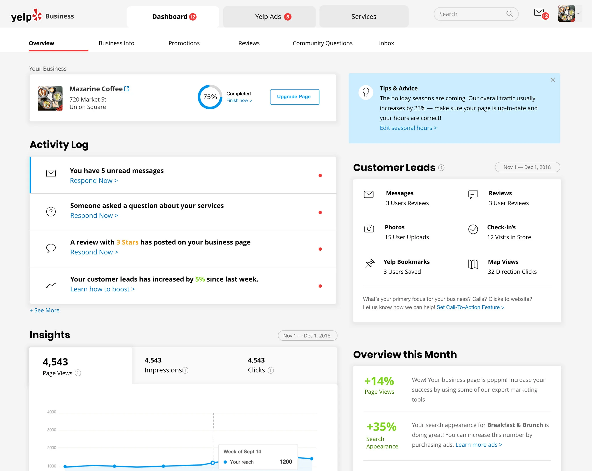
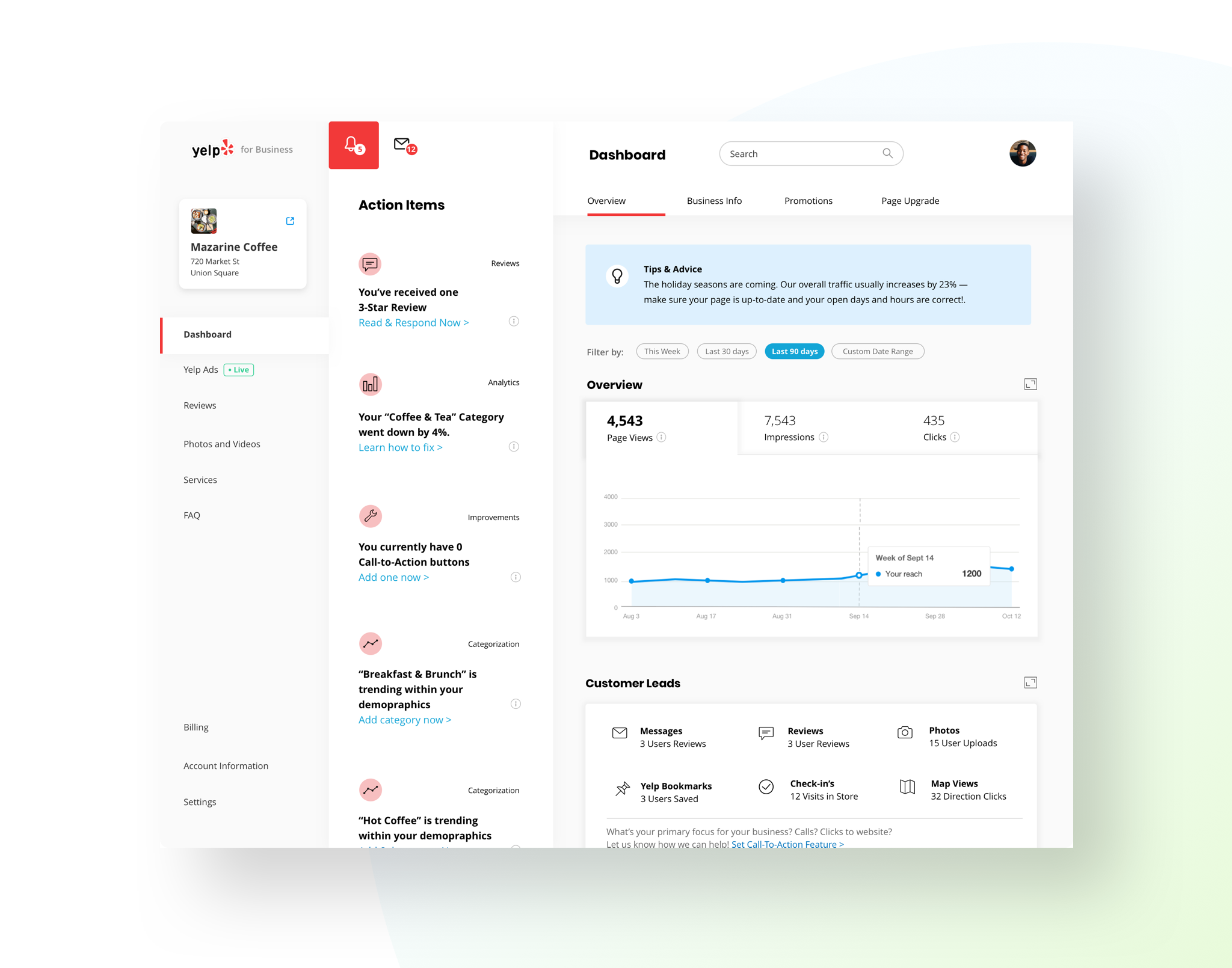
My concept centered around addressing the common issue and feedback we receive from our business owners, which is the lack of understanding and value perceived from their dashboard. The key solution was to introduce "actionable items" on the second-to-left column, providing users with insights and clear actions based on their page or ad performance data. This approach helps users to understand their dashboard and guides them on how to improve their business. For instance, if a user receives a neutral or negative Yelp review on their business page, the system advises the business owner to respond positively in order to improve their reputation.
It is important to note that these designs are not final and represent ongoing iterations towards the final product. Given that every product designer on the business team has a project that revolves around the BOA, it is critical that we are all aware of the holistic purpose of this redesign and the pain points of our business owners.