Educents UX Fixes
Educents is a ventured-backed marketplace to help homeschool parents discover educational resources provided by a community of independent sellers and small businesses. My role as a product designer was to design and fix the overall user experience across the e-commerce platform.
2016 — 2018
Product Design, User Research
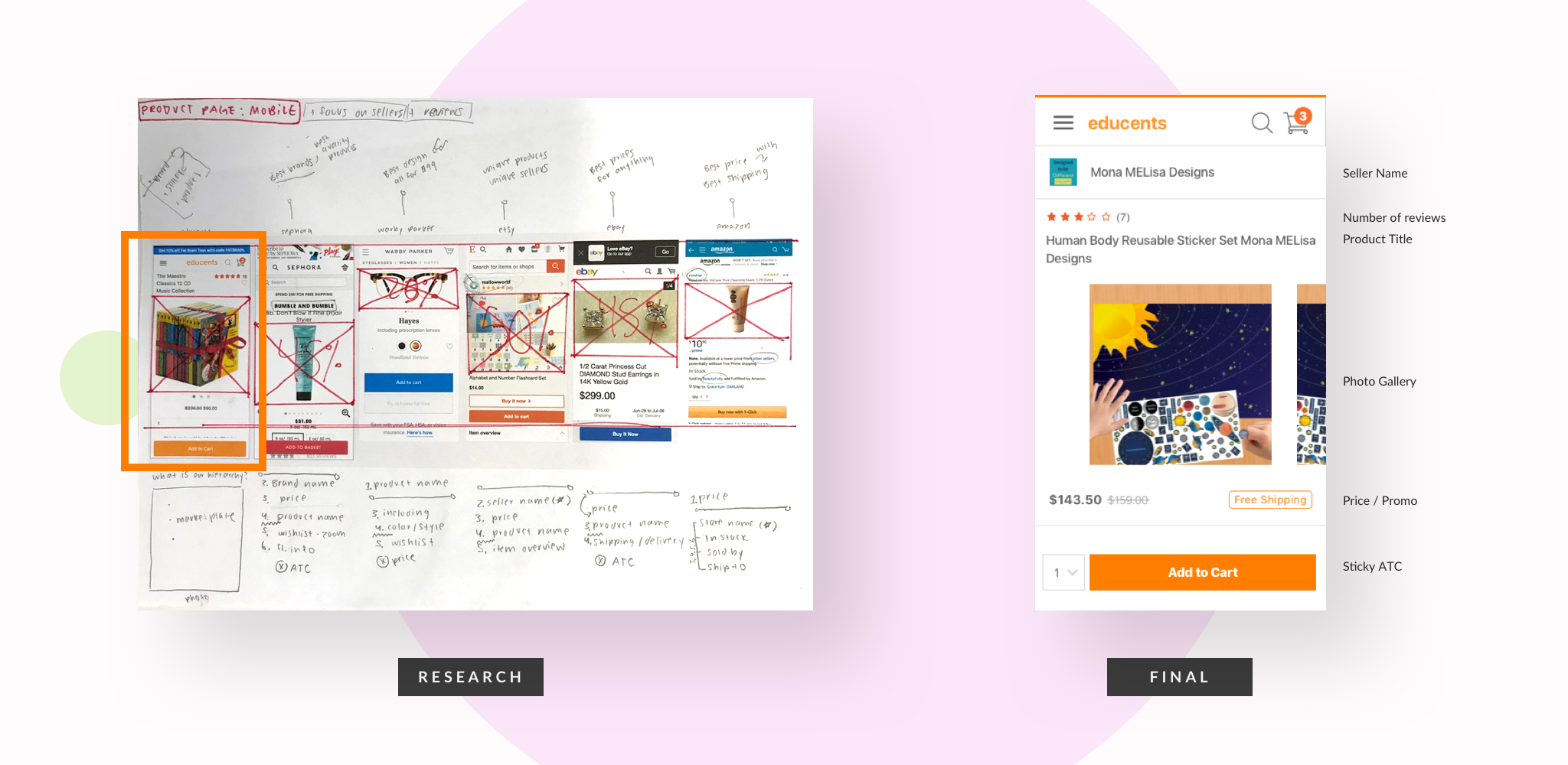
Mobile Product Pages
Our current mobile pages followed the responsive design based from our web layout. The first initial screen was dominated by the product image, which didn't provide a lot of context. While analyzing our competitor's mobile designs, it was interesting learning how they structure the importance of their business plans through the hierarchy in information architecture. Using this method, I wanted to focus on the content of the product page and the seller's storefront, to display we are an educational marketplace.
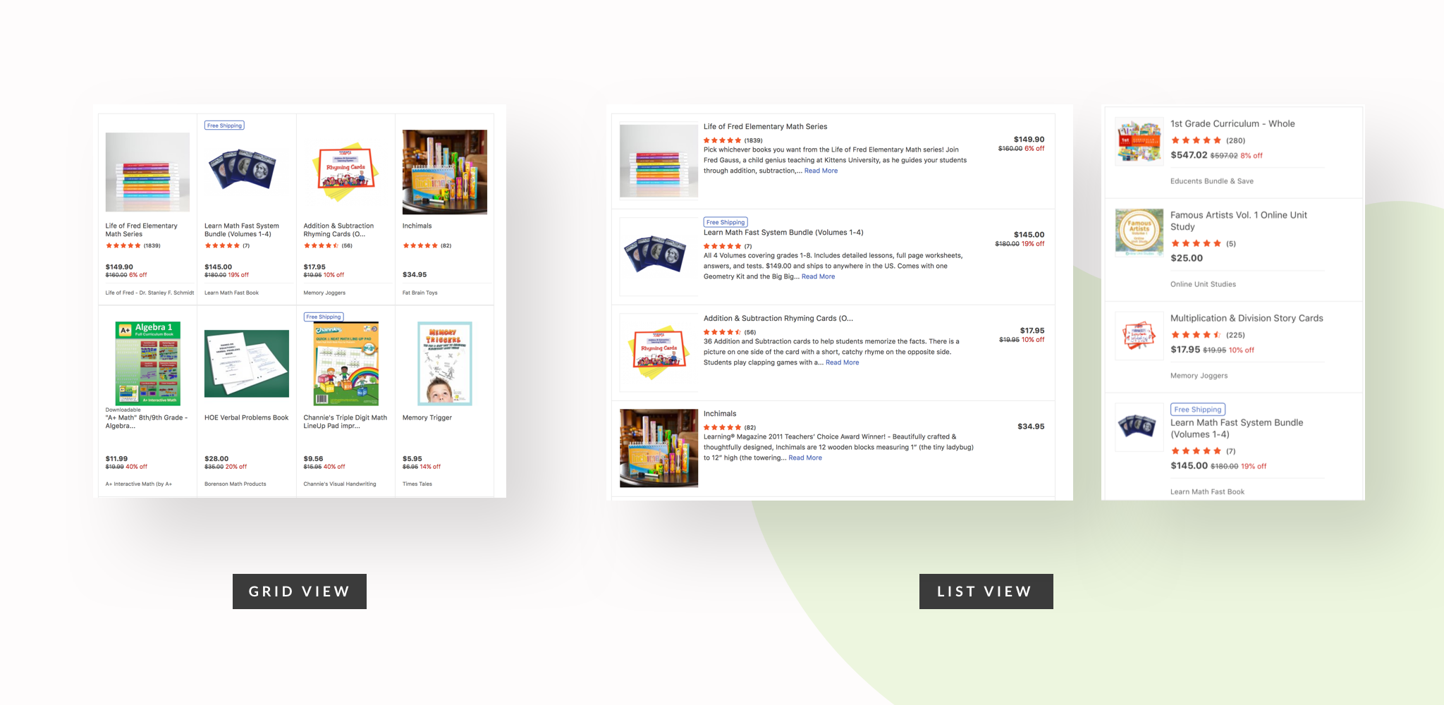
List View (web & mobile)
List view provides more context/details of the product and is preferred for reading comprehension rather than image. Grid view provides users making it best suited for visual content — usually the images dominate most of the cell space.
Like most e-commerce platforms, our products were displayed in a grid-view format. Because we sold books and curriculum bundles on our platform, we believed the images didn't give much context to the user when searching for products.
Creating a list view format will allow:
1. Better prioritization
If we prioritize information according to user needs then we achieve better scanability and guidance because the user can see all relevant information at a glance and much quicker.
2. More listings (mobile)
If we provide more listings on the screen then we can provide better comparability and offer more diversity on our platform because users like to compare a lot of listings on the result page.
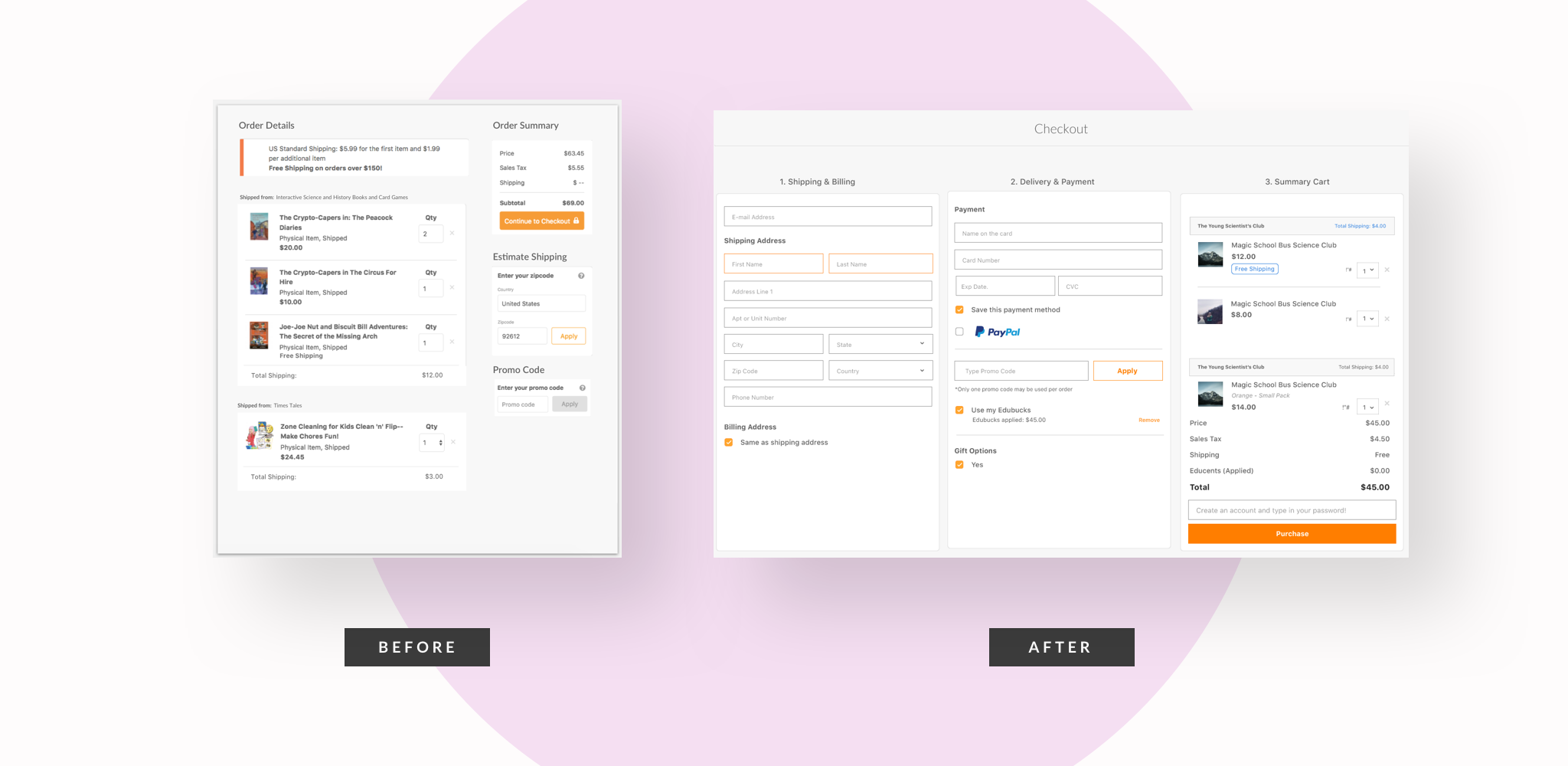
Problems at glance: our current check out page contained many dev bugs and errors, confusing the user, which affected our low ATC and a high number of bounce rates. It took an average time of 5-8 minutes for a user to place order (based on full story). The design contained many errors within the pop-up features and it was difficult to use.
We implemented a template with built-in payment and check-out functionalities and kept it simple and feasible with a one page layout. The built-in template also included a guest check out feature, which was ascent in the previous design.
Check out
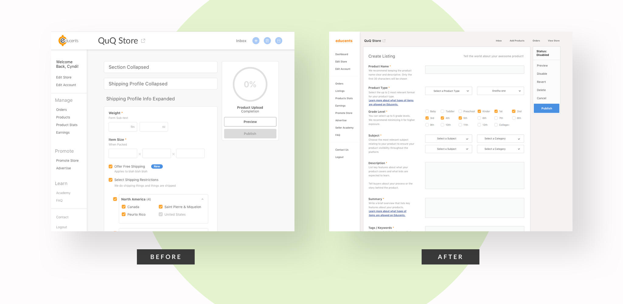
Our seller dashboard redesign was our attempt to make it easier for small businesses to sell their products on the platform, including providing features to make it easier for users to manage their products and promote their store. After the new design was implemented, we received user feedback on the confusing use of our product upload feature. Our operations team suggested we provided more coach marks on each step to help guide users during their process. The new layout gives a more organized section on the left, enough room for guidance and extra text.